Tuesday, October 28, 2014

The SOAPS on SUNDAY!


[1] Jane Arden panel drawn by Jim Seed, October 11, 1958

by John Adcock

“A novel designed to attract the million must be moral; virtue must always triumph in the end; and if a somewhat sentimental tone is thrown in; so much the better.” — ‘Sensational Literature,’ The Reader, Saturday, November 12, 1864
   
[2] April 24, 1954

‘SOAP OPERA’ was a term coined about 1940 to describe sentimental radio serials promoted to ‘the millions’ by sponsors of soap, coffee, cleanser and personal deodorant. The soaps were nothing startlingly new or original — they had their genesis in the early nineteenth century in stage melodrama and penny parts serials. Thomas Peckett Prest serialized Fatherless Fanny; or, the Mysterious Orphan (1841), in Reynolds’s Miscellany James Malcolm Rymer serialized The Divorce, a Story of Fashionable Life (1859), and George Biggs’ Family Herald (1843) offered weekly serials almost exclusively tailored to women. 

[3] Motion Picture Magazine, 1916

The first film serial was What Happened to Mary? (1912) which was followed up by Who Will Marry Mary? Her monthly tribulations had been serialized by Frederick Lewis in McClure’s Ladies World before being adapted to the silent screen.

[4] August 2, 1958
Comic strip soap opera’s heroes and heroines were solidly white middle class supporters of the status quo. The villains were not of the horrid Dick Tracy sort, like Mumbles or The Mole, rather they were mostly indistinguishable from the middle class heroes. Jane Arden’s handsome villains sometimes sported an identifying moustache, occasionally a crooked nose, but usually they resembled that clean-cut boy next door.

[5] Friday Foster
When Nicholas P. Dallis tried introducing a black maid into Rex Morgan in 1953 he was “stunned” to receive an avalanche of mail decrying the strip. He “got scared off” using black characters from then on. Black (and then only middle class) characters did not make an appearance in the soap strips until publication of Dateline: Danger! (1968-74) and Friday Foster (1970-74).

Friday Foster began in the Cleveland Plain Dealer. It was written by Jim Lawrence, who served his apprenticeship on the Hardy Boys and Tom Swift, Jr. series of boys books. The illustrator was Jorge Longaron of Barcelona, Spain. His work would be very familiar to readers of the weekly comic magazine Pilote in France and of various British girls comic annuals. 

[6] July 25, 1959
     
“…To sell tomorrow’s newspaper, he (the strip writer) must tell a serial story with the brevity of a telegram…” — Allen Saunders

WHILE I was growing up the Queen of the comic strip soap operas was Ernst and Saunders’ Mary Worth which was escapism of a high order. Spinsterish Mary was a biddy, a nosey parker, a rubberneck, a busybody and a buttinsky. I can still recall to my mind’s eye the pinched lip and glowering eye on Mary’s face as she scorned some man who had tampered with the affections of one of her wards. Ken Ernst drew Mary Worth’s facial features to resemble that of writer Allen Saunders wife Lois.

“I (Ernst) was absorbed with the way Lois looked. I’m not sure, but I think Lois actually, maybe even subconsciously, changed her looks a little to look like Mary. She even wears her hair in a bun.” —‘Mary Worth is a Team Effort’, Pittsburgh Press, April 12, 1978

Mary Worth began as Apple Mary by Martha Orr, but it was not the first soap opera of the funnies. That was Sidney Smith’s humorous serial The Gumps debuting on February 12, 1917. Allen Saunders credited Sol Hess, a successful Chicago jeweler and gag-writer, for the success of the strip. Similar humorous soap strips were The Nebbs by Sol Hess and Walter Carlson (May 22, 1923), Mom’n Pop by Wood Cowan (1928?) and Boots and Her Buddies (1924).

[7] Scriptwriter Sol Hess makes an appearance in The Gumps, January 14, 1920

More realistic approaches were taken by the creators of Dixie Dugan (Oct 1928) and Jane Arden (Nov 1928). Apple Mary used a similar approach beginning in 1932.

Mary Worth eventually had three scriptwriters working simultaneously. Allen Saunders son John Saunders began working on the scripts as early as 1948 and eventually took over the writing from his father. He had his own strip, Dateline: Danger! and assisted on Steve Roper and Mike Nomad. The third writer was Ken Ernst Jr. whose father once observed “he thinks like Mary Worth.”

Ken Ernst was the guardian over the propriety of the strip. By 1976 the tastefully done depiction of 17 year old character Karen Cooper’s unwanted teen pregnancy ran without complaint but did generate a lot of press coverage. 

[8] October 11, 1958

Another long-running strip was Jane Arden by writer Monte Barrett and artist Frank Ellis published by Register and Tribune Syndicate on November 26, 1928. Jane Arden was ‘soap opera’ from its beginnings through 1968, although the term was not current until the nineteen forties. Compared to The Gumps and its copycats, Jane Arden was drawn in a very realistic style.

[9] June 10, 1937

Barrett was replaced as writer by Walt Graham in 1952 and later artists included Russell E. Ross (1935-52), Jim Seed, William Hargis and Bob Schoenke. The strip was very popular in Canada. Jim Seed was the artist I remember. I have a small run of the following tale about wiseguys putting pinball machines in candy stores to turn the teens on to gambling. I actually remember reading this when it came out, in the 1956 Star Weekly. I was six years old. Allen Saunders could have explained my interest (diverted from Donald Duck and The Fox and the Crow). The strip writer “strives to chart a story course which will interest intelligent adults without baffling ten year olds.”


[10] January 28, 1956
JIM SEED drew his panels with clean lines and simple backgrounds. He was born James E. Seed in 1927 in Toledo, Ohio. His first comic strip work was on Don Dean’s Cranberry Boggs (1945-49) and Dr. Guy Bennett (1955-56). Jane Arden, which he drew from 1955-60, was the only strip he signed but Seed also contributed ink to Steve Roper, Judge Parker and Rex Morgan, M.D.

Seed died in 2010.        
 
[11] January 3, 1970

Rex Morgan M.D. (Allen Saunders had a hand in its creation) would be on the top of my list of favorite pen and ink confessions. Psychiatrist Dr. Nicholas P. Dallis – pen names: Nick Dallis and Dal Curtis — scripted the strip which was drawn with dark style by Frank Edgington and Marvin Bradley. It began appearing in 1948. Given the chance this excellent team could have drawn a nice hard-boiled detective strip. Imagine a comic strip adaptation of James M. Cain’s The Postman Always Rings Twice by Edgington and Bradley.

[12] July 25, 1959
  
DANGER IN GIVEAWAYS. Among the public service comic book giveaways for 1952 was one called Trapped, published by the Committee on Narcotics of the Welfare Council of New York City. Dr. Dallis took his professional duties seriously and educated the public about drugs, alcoholism and mental illness through his comic strip scenarios. It was recognized by publishers that “there is a potential danger of giving to youth the detailed description of how narcotics are taken.”

[13] May 14, 1960
  
Judge Parker was begun in 1952 with artist Dan Heilman drawing until 1965. Dallis and artist Alex Kotzky introduced Apartment 3-G in 1961.

[14] November 22, 1958
    
NEA syndicate’s The Story of Martha Wayne began on May 4, 1953. Writer/artist was Wilson Scruggs, and his wife Ellinor was the model for Martha Wayne, a war widow. Scruggs, born in Washington, D.C., had a background in illustration and had contributed to Life, The Saturday Evening Post, Collier’s and Redbook. He was a student of illustrator Harvey Dunn.

[15] May 14, 1960
  
David Crane was a comic strip about a minister and in early days often featured actual sermons. Ed Dodd (Mark Trail) was the writer and Hamilton, Ontario born James Winslow “Win” Mortimer was the original artist. Creig Flessell (Superman) replaced Mortimer in 1960.

[16] April 14, 1955
   
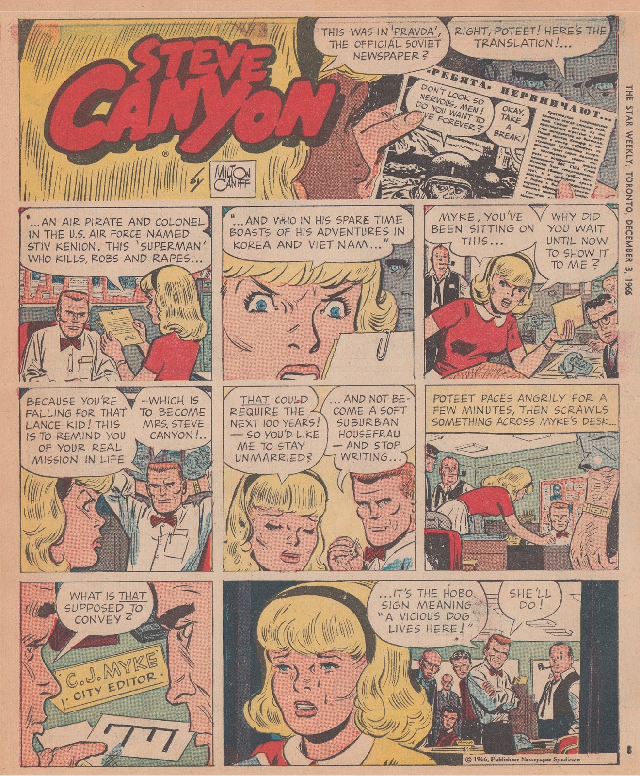
Some of the top adventure strips also dabbled in soap opera occasionally. Abby ’n Slats generally featured soap continuity in the dailies and adventure in the Sundays. In Steve Canyon, when he wasn’t busy flying the globe, Steve was involved in numerous long-running romantic serials.

[17] January 21, 1956
   
Serials about Poteet Canyon, “Steve’s onetime ward and kissin’ cousin” introduced in 1956, were pure soap during her college days and newspaper career. 

[18] December 3, 1966
  
STILL WAITING. I’m still waiting for a definitive history of soap opera comics. Even a hardcover collection of the best of the various 50s and 60s Mary Worth, Rex Morgan, M.D. and Jane Arden Sundays would be welcomed to my bookshelf.

[19] August 5, 1961
  
I have only covered the half of it. Not mentioned are Pam by A.W. Brewerton (c.1936), Myra North, Special Nurse (1936), Irv Novick’s Cynthia (1946-53), Big Ben Bolt (1950), The Heart of Juliet Jones (1953), Mary Perkins, On Stage (1957), Adam Ames (1960), Honor Eden (1960), Dr. Kildare (Oct 1962), Ben Casey (1963), and scores of others. England produced numerous soaps. Jane (Dec 1932) and Tiffany Jones (1964) are probably the best known. Both appeared in North American syndication.

[20] January 8, 1977
THE WORST soap may have been the last of the breed, Stan Lee and Frank Springer’s over-the-top The Virtues of Vera Valiant (1976). Probably no other comic strip ever received so much well-deserved abuse in the letters to the editor. A number of color Sundays are available HERE. I was unable to find a good reproduction of the opening strip so reluctantly post this poor quality sample. In three small panels Stan Lee and Frank Springer encapsulate the essence of soap opera.

[21] October 11, 1976
NOTE. Sharp eyed readers will have noticed that Canadian comic supplements were issued on Saturdays instead of Sundays. In the United States supplements were really issued on Sunday.


SOME FURTHER READING
One Good Apple Proves a Barrel’s Worth, by R.C. Harvey HERE.
Teepee Town to Times Square, HERE.
The Comics are a Serious Business, by Allen Saunders, August 1945 HERE.

[22] December 3, 1966

Friday, October 24, 2014

The Painter and the Cartoonist


     “Even a casual reader of ‘Dick Tracy’ finds his memory’s dam bursting with recollections … and images.” Richard Marschall, ‘This IS a Comic Strip!’, Nemo 17, Feb 1986
by John Adcock

CHESTER GOULD had many imitators among comic strip artists but he was one of a kind, as writer and artist. The only cartoonist whose influence on Dick Tracy I could ever discern was that of Frank Willard’s Moon Mullins, as can be seen in the faces of Detective Sam Catchem and characters in Tracy’s crowd scenes. Gould mentioned his admiration for Moon Mullins in an interview but Johnson’s influence was slight. Another strip, The Gumps by Sidney Smith, inspired Gould’s storytelling style.

With little to compare him to in cartoonist circles, writers over the years have turned to the fine arts for comparison. Chester Gould’s comic strip style has been described as realist, expressionist, Dadaist and surrealist, and — in one obituary — Gould was headlined as the “Father of Pop Art.” All of these comparisons are valid although Gould himself might have had minimal interest in Fine Art.

1967 — ‘Pacific’
THE FINE ARTIST whose work most closely resembles that of Gould (1900-85) was the Canadian painter Alex Colville (1920-2013), dubbed a “Magic Realist” (he personally preferred the term “straight realism”) who worked steadily from 1951 until his last painting in 2009. Colville, like Gould, was a unique artist and a private person. He reintroduced the practice of egg tempera into Canadian painting.

He had several younger Canadian imitators (Christopher Pratt, Ken Danby and Tom Forrestall) but didn’t consider himself the leader of any “school” of painting. Some of his followers among the photorealistic wildlife painters drifted into the controversial commercial print business. None of Colville’s imitators ever surpassed his stature among Canadian painters however. In 1967 he designed the Centennial Coins – beautiful bird, fish and wildlife designs issued to celebrate the hundredth anniversary of Confederation.

“The thing that hit me hardest was the ancient Egyptian art and, of course, its main theme is death, eternity, and all that business.” Its secret lies in a system of mathematics that, millennia later, in a cold attic in Atlantic Canada, Colville uses to make geometric grids for the composition of every spooky painting he puts together. – Harry Bruce article Beside the Shadow of the Raven, 1977

1965 — ‘To Prince Edward Island’
COLVILLE practiced magic realism in a sharply defined realistic style, with elements of the fantastic and the emotionally psychological. His figures were strongly outlined and looked almost like cutouts pasted onto the painted backgrounds. Chester Gould’s drawings also mixed detailed realism with the emotionally disturbing, and both artists used a clear line, flat shapes, frozen time, and sharply defined grid-like structures to anchor visual space. Columnist Harry Bruce described Colville’s grids as ‘his ancient Egyptian geometry.’

“— in varying degrees, Dick Tracy proposed a new standard of precision, a rediscovery of precision such as only those artists, major and minor, who are entitled to be taken with full seriousness, ever deal with. Like Aubrey Beardsley and Max Beerbohm, Chester Gould insists, in his work, on presenting the terms and figures of darkness in the imagery of a superhuman, murderous daylight, the language of impeccable identification.” — ‘Flat Foot Floogie’ by Donald Phelps, Nemo 17, Feb 1986
Gould departed from realism only in his use of exaggerated caricature to delineate his human characters. My feeling is that if Gould’s style must be compared to fine art then magic realism is closer to the descriptive mark than expressionism or surrealism.

Colville’s paintings were widely reproduced in Canadian periodicals but I wouldn’t think that Gould was familiar with Colville’s work, or vice versa. If Gould knew of magic realism it would probably have been through the American paintings of Andrew Wyeth. Nonetheless a comparison of their works discloses a startling similarity of ideas and execution.

1955 — ‘Dick Tracy’, Star WeeklyNov 19
I already entioned the grid-like structure of Colville’s paintings and Gould’s panels, both used straight lines for horizons separating earth from sky, and both frequently cut off the heads of figures in their panels. (Gould often hid them behind word balloons.) Colville’s 1967 painting Pacific cuts off the head of the main figure as does River Spree from 1971. Woman with Revolver decapitates the head and feet.

“…frequently cut off the heads of figures in their panels…”

COULD Colville’s compositions have been inspired by Dick Tracy? Perhaps the question is not as far-fetched as it seems. Colville was eleven years old when Tracy made his debut in 1931. As a Canadian sponsored war artist he may have come across Dick Tracy in comic books, the choice reading of troops serving overseas. If Colville read newspaper comics in the 50s and 60s he couldn’t have missed Dick Tracy, which appeared in many comic sections including The (Toronto) Star Weekly, The Winnipeg Tribune and The (Vancouver) Sunday Sun.

1958 — ‘Birds of Canada; Robin’, by James Fenwick Lansdowne, August 23
I RECALL that in the 60s every time Alex Colville finished a painting it would be reproduced large-sized in the weekend magazine supplements like (Toronto) Star Weekly (1910), (Montréal) Weekend Picture Magazine (1951) and the Canadian (1965). Ken Danby, James Fenwick Lansdowne, and Robert Bateman were others honored with full page color reproductions. Turning to the comic supplement in the same package you would find the Sunday Dick Tracy.

1956 — ‘Dick Tracy’, Star Weekly, June 30
Life magazine stated that “Dick Tracy is bought every day in the year by 18,500,000 people, and is probably read by twice that number.” The Dick Tracy comic books claimed sales of 25 million. It would be more likely that Colville was familiar with Dick Tracy than that Gould knew of Alex Colville, who scoffed when newspaper articles referred to him as an international celebrity. Twenty American museums rejected showings of Colville’s 1984 Retrospective exhibition of paintings and Colville said “I can’t imagine more than five per cent of Canadians are aware I exist.” I think he was being modest.

1975 — ‘Dog and Priest’


Harry Bruce, Beside the Shadow of the Raven — Why death suffuses the art of Alex Colville, Montreal Gazette, Jan 15, 1977.
Alex Colville obituary, The Telegraph, Aug 22, 2013 HERE.
Chester Gould obituary, Los Angeles Times, May 12, 1985 HERE.
Andrew Wyeth Page HERE.
All Alex Colville images (copyright A.C. Fine Art Inc.) are reproduced with permission of Official site of Alex Colville HERE.

Sunday, October 19, 2014

Posada Art Books, a Dutch miracle in Brussels


[1] Posada Art Books. A photo I took of Ada en Martijn Oleff in front of their shop, at Spoormakers straat 50 rue des Éperonniers in Brussels on 22 September 1980.

by Huib van Opstal

‘The spark hit me… A fascinating world…’
   
STEPPING INTO his bookshop, Martijn Oleff instantly gave you the feeling you were an old friend. I bet he did that to every customer of Posada, the shop he and his wife Ada Roorda ran in Brussels, the capital of Belgium. Their Posada began in 1974 as a small gallery specialized in art prints (‘grafiek’) and was named in remembrance of a Mexican artist-engraver who published and sold his raw prints and pamphlets in his own shop too, José Guadalupe Posada (1852-1913) – with the added attraction it contained Ada’s first name.

[2] Mexican newspaper boys. Niños voceadores de periódicos on the cover of a stapled booklet, engraving on type metal by J.G. Posada, c.1900; sent out as a Posada Art Books mailing around 1979.

POSADA ART BOOKS moved house twice, but all three addresses were located in bilingual Brussels. The first in 1974-81 was at Spoormakers straat 50 rue des Éperonniers, zip code 1000, at the heart of the city. A shop that soon morphed into a very special type of bookshop that offered what was called ‘Art visuel (livres neufs et d’occasion),’ every type of art publication in any language, new or used. A spicy detail is that the Belgian book trade at the time saw selling modern art and books in foreign languages in Brussels as suicidal. But Posada Art Books became a thriving business: a Dutch miracle in Brussels.

[3] Posada mailing. Six thematical book lists folded into El purgatorio artistico, engraving on type metal by J.G. Posada, c.1900; sent out as a Posada Art Books mailing around 1979.

DUTCH BOOK HISTORIAN Piet J. Buijnsters published his latest book in 2013, when he was 80 years of age, a history of the antiquarian book trade and the love of books in Belgium, a work applauded as a ‘trailblazer’ — titled Geschiedenis van antiquariaat en bibliofilie in België (1830-2012). In this 432-page book Buijnsters included 35 of his personally conducted interviews with Belgian antiquarians and collectors. In the Summer of 2010, one of these was held at Posada Art Books in Brussels with an antiquarian who already knew the days of both his bookshop and his life were numbered: Martijn Oleff, who spontaneously gushed out a wide range of names and details that once inspired his career. Almost ‘a long monologue’ according to Buijnsters.

[4] First Posada logo. A stylized symbol looking like a mirrored S. Was it Mexican? A good-luck sign? A labyrinth?

ADA S.B. OLEFF-ROORDA. Martijn and Ada, both born in 1941, came from the Netherlands (or Nederland, or Holland), he from Rotterdam, she from Scheveningen (part of Den Haag, or The Hague). They met in their teens and after some international stints in the book and print trade in the Netherlands, the US, Mexico and Spain, decided to try their luck in Belgium in 1974. They did their business in Dutch and French, and spoke some German, English and Spanish as well.

MARTIJN CORNELIS OLEFF (born 10 October 1941, Rotterdam, Zuid-Holland — ‘Oleff, that’s Scandinavian’ he told his interviewer), first worked as a biochemical analyst at Organon in Oss, Noord-Brabant, much to his dissatisfaction. In the early 1960s he stayed in Spain for many months. He then began to work as factotum for the small publishing company of Ad Donkers in Rotterdam, at the same time following a two-year correspondence course in Bookselling & Publishing. Just-married, he and Ada headed for the US where he landed a job with art book seller Wittenborn and Co. in New York.

[5] Art book seller. George Wittenborn managing his paperwork in the 1960s.
GEORGE WITTENBORN (1905-74, Jewish, fled from Germany in the 30s) with his wife Joyce Phillips (from England) in the US mainly dealt in imported art books, the latest titles from the finest European publishers from Germany, France, the UK, Spain, Italy. The Wittenborns. also published books and since 1956 used every inch of available wall space of their Madison Avenue shop as their ‘One-Wall Gallery.’ Martijn Oleff couldn’t resist mentioning that artists Roy Lichtenstein and Andy Warhol were frequent visitors at “Wittenborn and Company, 1018 Madison Avenue.
‘Working with Wittenborn, the spark hit me… A fascinating world… I got to know many other book traders, and major customers and museums too.’ Martijn Oleff  (in: Buijnsters, 2013)

[6] Don Quichotte. ‘A ‘calavera’ or skeleton-view featuring Don Quixote, a broadsheet print by José Guadalupe Posada, engraving on type metal, c.1900; published around 2 November — All Souls’ Day or “the Day of the Dead” in Mexico.

WANDERINGS. While working and living in the US for two years, in New York, Martijn developed an interest in Mexican culture and began to collect the metal cut prints of J.G. Posada. Since their residence permits expired after two years, he and Ada drove to Mexico to set up a bookshop there, for some gallery owner — a failed project. Back in Europe Martijn worked a couple of years at Editorial Blume in Barcelona, Spain — abruptly ended by Sigfrid Blume’s bankruptcy. Then, around 1970 in Ada’s hometown The Hague in the Netherlands, they set up Edition Unida and published ‘multiples & graphics’ (‘grafiek’) of modern artists. When their financial backing fell away they tried their luck in the South, in neighbouring country Belgium, in the city of Brussels. In April 1974 they opened their first Posada shop at Spoormakers straat 50 rue des Éperonniers, initially using the rented premise as a small gallery to sell the remainder of their art prints — which didn’t work out as expected.

SELLING old and new fine art books became their core business, although they kept selling art prints and multiples. Martijn was always snooping around for good old stuff, in other shops, at the Vossenplein place du Jeu de Balle flea market in the old city of Brussels, at trade fairs. Posada as a bookshop really took off when it acquired the complete stock of bookseller Hankard.

[7] Cheese market. A walk along the Spoormakers straat rue des Éperonniers, a view towards the Kaasmarkt rue du Marché aux Fromages, c.1905 photo.
[8] Cows and cheese. A walk along the Spoormakers straat rue des Éperonniers — a closer view of the Kaasmarkt rue du Marché aux Fromages, the location where the cheese market was held, c.1905 photo.
[9] Adverts. A walk along the Spoormakers straat rue des Éperonniers, a view of the large wall advertising at the Kaasmarkt rue du Marché aux Fromages, with already a glimpse of number 50 in the distance, on the left, 1905 photo.
[10] Corsets and lace. A walk along the Spoormakers straat rue des Éperonniers — the shop at number 50, c.1910 photo. When Posada Art Books left here in 1981 the shop was taken over by Wijnand and Mieke Plaizier who specialized in posters and cards.

AFTER SEVEN YEARS at Spoormakers straat 50 rue des Éperonniers Martijn and Ada moved their shop to a larger space around the corner, their second Posada shop, at Magdalena steenweg 27 rue de la Madeleine, in 1981. Finally, seven years later again, they moved to the adjoining building at number 29, their third Posada shop and a truly glorious location, in 1988.

Six years earlier, Belgian graphic artist Ever Meulen was commissioned to make a brand new Posada Art Books logo, in 1982.

[11] Bilingual streets. A 1970 list of all street names in the Brussels area in both Dutch and French, with zip codes, titled Lijst der openbare wegen van de Brusselse agglomeratie met aanduiding van de postnummers; Liste des voies publiques de l’agglomération Bruxelloise avec indication des numéros postaux. Paperback, size A5, 315 pages, plus 46 pages of later added modifications (in the shape of 9 inserted booklets, 1970-81), published by the Belgian Postal Administration and untouched by designer’s hands.

PART OF the larger kingdom of the Netherlands until 1830, Belgium split itself off by a nationalist revolt and became the present kingdom of België or Belgique situated between the Netherlands and France. But its population still bickers on about its multiple languages. Today a larger half of around 60% of Belgians speaks Flemish (Dutch, also in dialect). A smaller half of around 39 percent speaks Walloon (French, also in dialect) — even German speakers claim one percent. Today, a linguistic frontier officially splits the country in two: only Dutch spoken in the North, only French spoken in the south. On top of it, Brussels, its capital right in the middle, is bilingual with all street name signs lettered in Dutch and French, crammed in any size of sign, no matter how long the text runs. But this French-Dutch agglomerative wall dictionary is never read in full. To turn a blind eye to the opposite language, to half of the names, is standard procedure. Denial is the second name of most Belgians.
[12] Bilingual street name sign. ‘Spoormakers’ or ‘éperonniers’ were makers of spurs.
‘With customers from both sides of the linguistic frontier, I wasn’t troubled by the linguistic conflict in Belgium. But some customers had a problem with it themselves. Resulting in customers standing outside, before the shop window, waiting until the Flemings inside left, or vice versa!…’Martijn Oleff  (in: Buijnsters, 2013)

YOUNG and Dutch, I was working as art director-designer for a Dutch bi-weekly pop music paper — Muziekkrant Oor — when chief editor Jan-Maarten de Winter and I commissioned a series of section logos from Eddy Vermeulen for the year 1978. Eddy was a top-notch graphic artist from 1946 who worked in Brussels under his trade name ‘Ever Meulen.’ A few years later I managed to connect Martijn Oleff with him to have an illustrated Posada logo done.

[13] Posada logo design. Some of the initial pencil sketches by Ever Meulen, 1982 — with the germ of the triple-A idea…
[14] Pencil sketch. Logo, final design sketch in pencil by Ever Meulen, with the triple-A idea developed into a mask-like lettering.
[15] Final version. Hand-lettered, in Indian ink.
[16] Printed version. Used in a variety of print products in 1982-2011.
THE WAY Martijn Oleff with his jolly walrus mustache is portrayed in Ever Meulen’s final logo design for Posada is spot on: when a customer walked into his bookshop Martijn would look up as an old friend… in the midst of some intense research… Then offered you coffee with a smile, and books and papers in every shape or size. And whatever book or artist you mentioned, he always shared some stimulating insight about it – producing more and more printed works you’d never seen before. Strips or bandes dessinées were limited to just half a shelf and he jokingly agreed “to hell with comics!” — the incredible shrinking medium with its zealots and their restrictive definitions. Reaching mainstream audiences with comics was already on the wane in the 1980s.

[17] Already a memory. The third Posada shop on the cover of a Dutch book about the Belgian antiquarian book trade, by Piet J. Buijnsters, published in 2013.
2010-2011. In his final working year at the Magdalena steenweg rue de la Madeleine, Martijn Oleff reminisced about his international dealings in the past with:
…art book dealers like Heneage, Batterham, Sims & Reed in London, Perkins in Oxford, Laget in Paris, Vloemans in The Hague, Brouwer in Amsterdam, Ursus and Rietman in New York, Walter König in Cologne, De Nobele in Paris, and many others…Martijn Oleff  (in: Buijnsters, 2013)

THE GETTY. He took pride in having the library of the New York Getty Museum as a regular customer. He collected typewriters and ornamental prints (1830 and later). Published an occasional little catalogue himself and was blessed with Ada doing all day-to-day administrations. They lived in nearby Duisburg, halfway Brussels and Leuven-Louvain, arrived in the center of Brussels by car, six days a week, around seven o’clock each morning, and had their daily dinner at noon around the corner, in a cosy restaurant, often taken visitors with them.

[18] Martijn Oleff. Tribute in Elsevier magazine (detail with photo by Jan van de Wel).
 
FINAL. A final interview with Martijn and Ada in the Dutch weekly Elsevier under the header ‘A world bookshop’ (een wereldboekhandel) concluded in late 2010: ‘They’re tired’ (ze zijn moe). The new internet possibilities changed all book searching and selling. When closing shop in May 2011 Martijn was approaching seventy and physically already suffering unspeakable diseases. He finally passed away in Duisburg around ten o’clock in the morning of Tuesday 10 June, 2014. His cremation was the following Saturday, in silence; twenty of his family members were present at the funeral service.

[19] Closed down. The shopfront the week after, early May, posters in four languages, Dutch, French, French and German, saying: ‘Posada art books will be permanenly closed from May 3, 2011. We thank our customers and our colleagues for their friendship and loyalty.’

[20] In fond memory. Martijn Cornelis Oleff, bookseller, b. 10 October 1941, Rotterdam, Nederland – d. 10 June 2014, Duisburg, België.

THANKS TO:
Piet J. Buijnsters
Marcel Cattoor
Eddy Vermeulen
Jan-Maarten de Winter
Mieke & Wijnand Plaizier
Universiteit Gent
Elsevier Weekblad
Carla Joosten
Ada S.B. Oleff-Roorda

In late 2011 the premises at Magdalena steenweg 29 rue de la Madeleine were rented to chocolatier Neuhaus, who offers chocolat only in an interior setting of cold glass and marble. The old-style interior has been knocked out. 

Go back to the interiors of all four floors of the Posada bookshop in early 2011 via dozens of photos HERE.

See Martijn in Posada in early 2011 HERE.

See the website initiated by Martijn Oleff, Les Polyèdres, set up by Remy Bellenger HERE.

…Venez chez moi, je vous montrerais mes Polyèdres…Alfred Jarry, Ubu Cocu

See the present Plaizier shop HERE.

See Ever Meulen HERE and HERE.

See the 2013 book by Piet J. Buijnsters, Geschiedenis van antiquariaat en bibliofilie in België (1830-2012) at Vantilt publishers HERE.